Graphic Design for Educators, Part 2: All About Alignment
When in doubt, line it up

Welcome to Part 2 of iLearnNH’s Graphic Design for Educators series! This installment explores the power of alignment, including how to use it to make sure students actually look at what you create, why left-aligned layouts work best, and what role headings play in clear, accessible design.
If you missed it, in part Part 1 we covered the why and the how: why design matters, how teachers can build confidence with the design skills they already use, and how understanding your audience can transform your materials.
And just quick reminder: if you’re in New Hampshire, you can also reach out to info[@]iLearnNH.org to schedule an in-person Graphic Design for Educators training.
Have you ever looked at something—a presentation slide, a social media post, a flyer pinned to a coffee shop wall—and decided it’s too much work for your brain to sort out? Maybe there’s too much text, uneven spacing, or elements scattered without logic. So instead of deciphering it, you just… move on.
We’ve all done it—clicked away, scrolled past, or ignored a design that felt too chaotic. And guess what? Your students do the same thing.
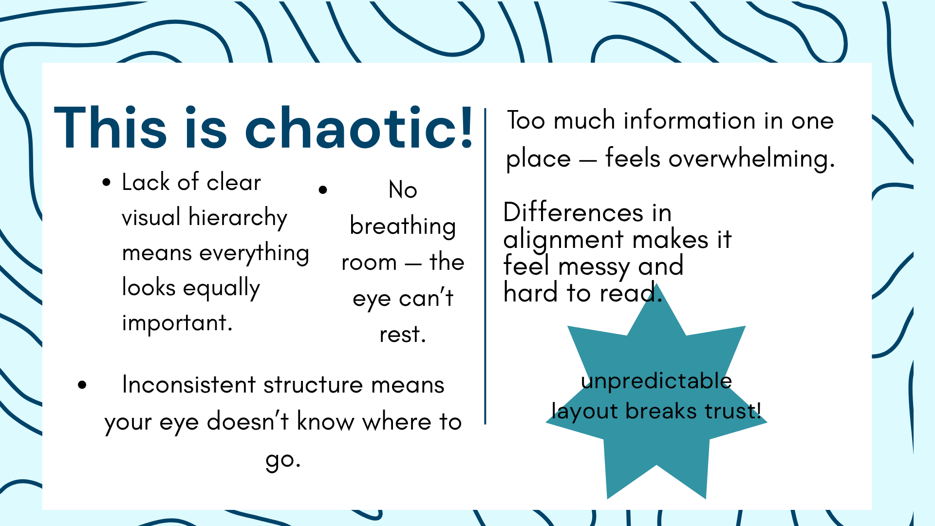
Since we don’t want to make it easier for them to ignore the resources we’ve worked so hard to create, we need to be intentional about the way we design them. That’s where alignment comes in.
Alignment Establishes Relationships
Alignment is the practice of positioning elements so their edges or centers line up with each other, creating a sense of order and connection. It’s what turns a jumble of text boxes and images into a design that feels intentional, professional, and accessible.
Alignment does a lot of invisible work for learners:
It builds clarity. Consistent alignment makes layouts easier to follow and understand.
It creates connection. When elements line up, it signals that they belong together.
It tells a story. The distance between items shows how closely (or loosely) they’re related.
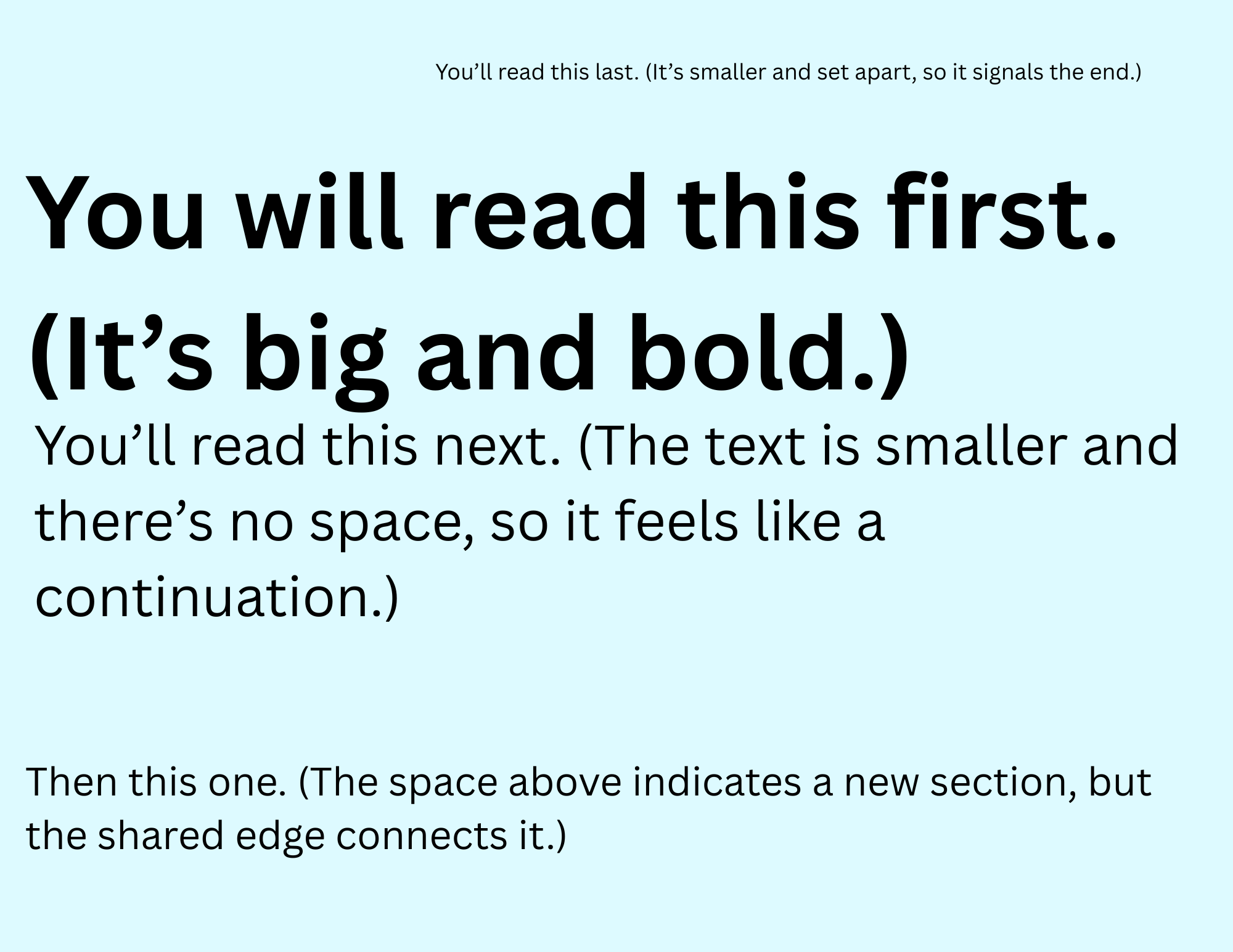
It guides the eye. Good alignment helps learners know what to look at first, next, and last.
Take a look at this image to see how your eye naturally moves through a text, the design subtly guiding you from start to finish:
The Power of Space
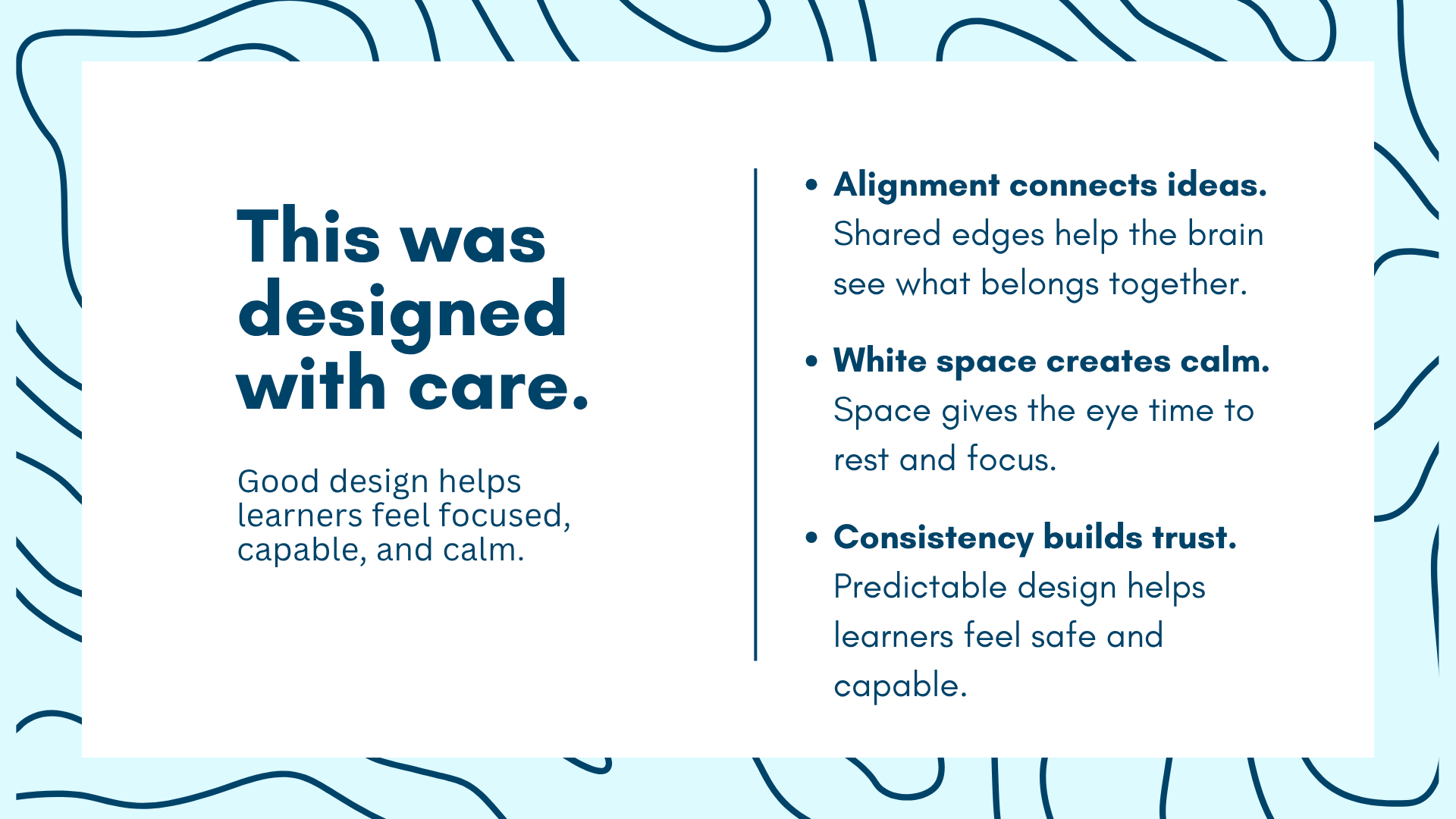
Alignment works best when it has room to breathe. We want our designs to feel spacious and be easy to comprehend, and one of the best ways to do this is through white space (which doesn’t have to be white, just empty of text or images). White space gives the eye a place to rest and the brain a moment to process; think of it like oxygen for attention.
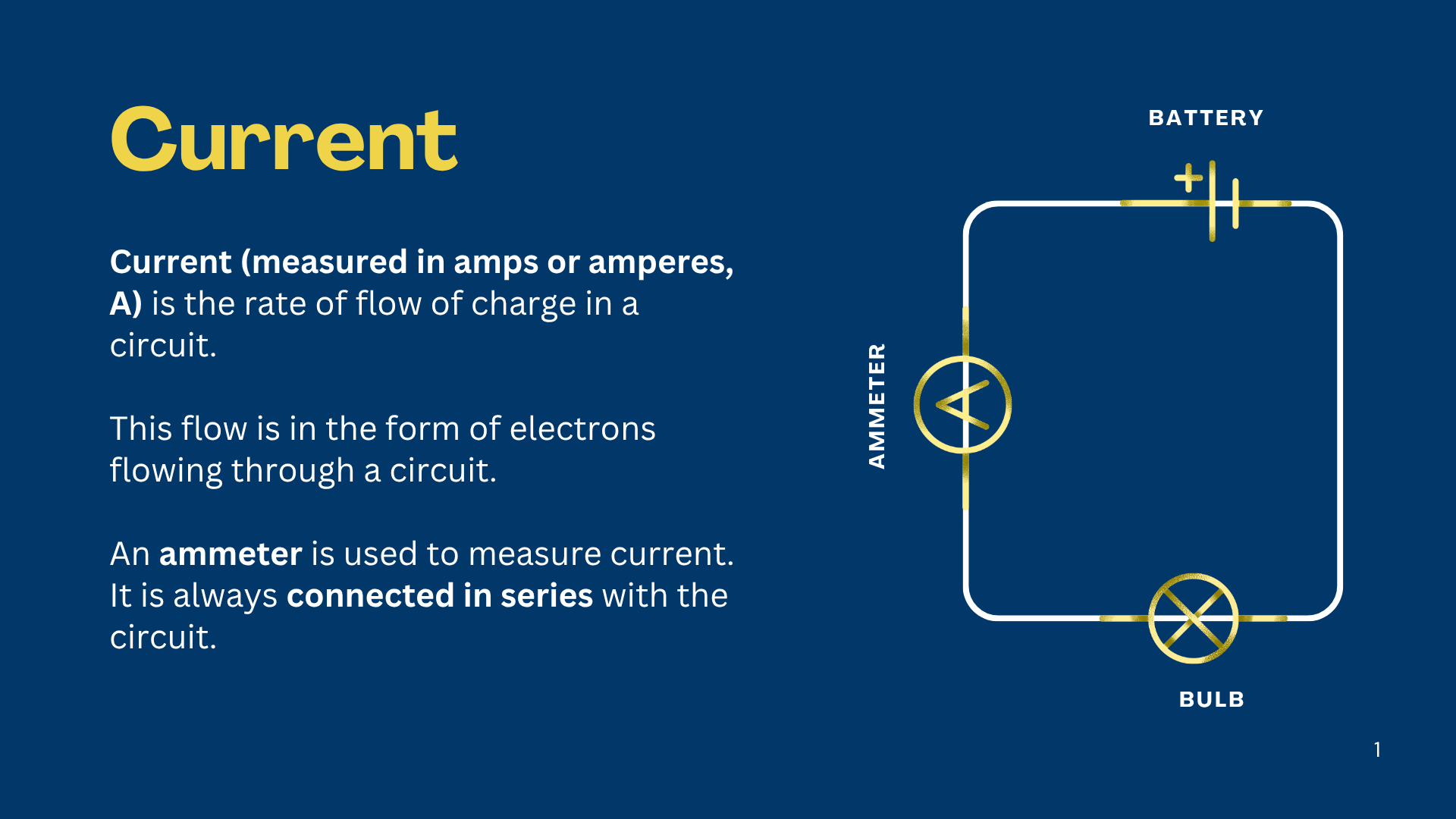
Notice how simple, spacious, and reassuring this slide feels — it almost makes you believe you could master the basics of electrical wiring, right?
In digital learning materials, distractions abound, which is why white space becomes even more valuable. Keep these ideas in mind:
Be sure to chunk content generously. Digital text needs more room than print.
In presentations, use extra slides. Remember, they’re free!
Be especially careful of using excessive images or GIFs. What you think seems to be engaging students might actually be overwhelming them.
When you remove clutter, you make space for clarity, which helps learners feel calm and capable.
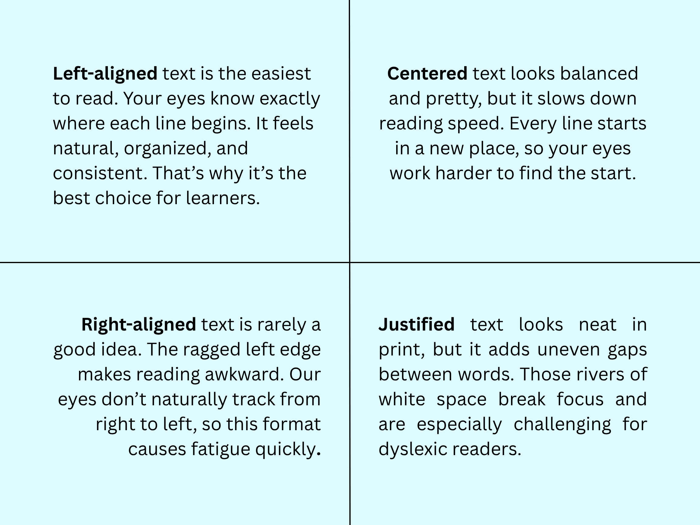
Left Alignment for the Win
Left alignment is a learner’s best friend. For English readers, it’s the most natural and accessible.
On the flip side, center alignment is harder to read. Ballot designers will intentionally use center alignment to force readers to slow down, which is not what you want your students to do. Avoid center alignment for large chunks of text. Reserve it for titles (but even then, left-aligning titles is perfectly fine).
Skip justified text in digital resources; it creates uneven spacing and is especially difficult for dyslexic readers. Most people avoid right alignment instinctively because it’s really hard to read, but yeah -- stay away from it.
Observe out how each of these alignment styles affects the way that you read the text:
Whatever alignment you choose, stick with it. Consistency creates safety. Keeping margins, spacing, and text alignment the same throughout a document builds trust and makes your design feel intentional.
Headings Guide the Way
Headings aren’t just big, bold text—they’re part of how you teach through design. Well-structured headings help readers find what matters most, make skimming easier, and guide attention where you want it. They also make your materials look more polished and intentional. Students will notice the care and organization, even if they can’t exactly name why. Everyone benefits from the structure that headings provide, but for learners using screen readers, clear headings are essential for navigation.
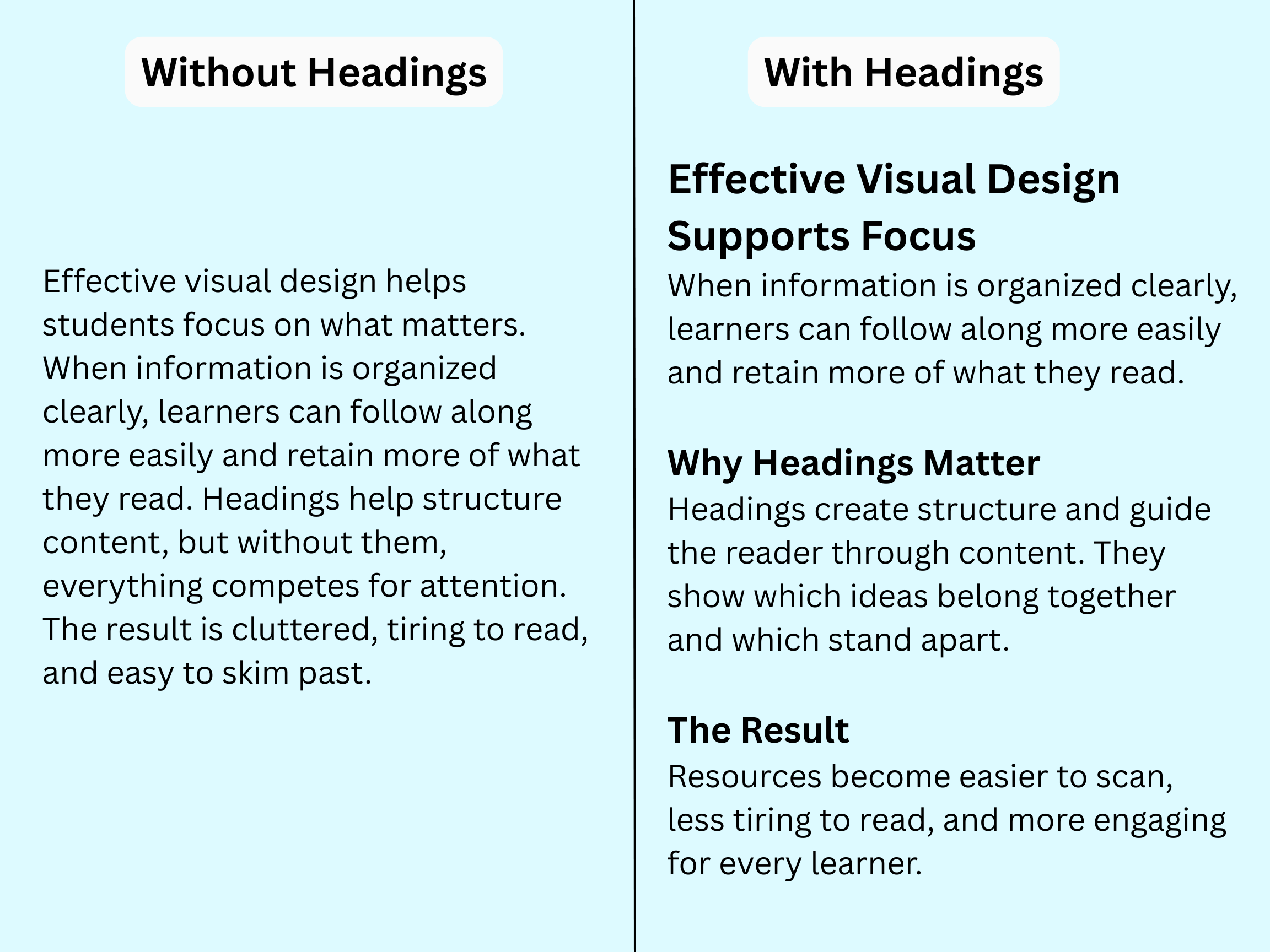
Best practices for using headings:
Use H1 for the main title (only once per document).
Use H2 for subheadings that introduce new sections or major ideas.
Use H3 for smaller, nested sections within those main ideas.
Keep your heading hierarchy consistent. Use the same levels, spacing, and order throughout your document so readers can predict what comes next.
Don’t rely on bold or size alone. True headers create structure, not just style. Use them to signal meaning and organization, not decoration.
Clarity Is Care
Good design isn’t decoration; it’s care. We create clarity, connection, and calm when we design learning resources with intention. Alignment is one of the simplest, quietest ways we can show students that their learning experience matters.
So the next time you’re building a slide, handout, or worksheet, take a moment to check your alignment. Even a small tweak can bring calm and focus to your design.